
Creating a landing page is easy, but knowing how to build the perfect landing page is what truly makes the difference in driving conversions.
Creating a converting landing page is challenging!
The importance of a landing page cannot be stressed enough. Your landing page is the first-place people visit when they land on your website.
This is your opportunity to capture their attention and prove that you will provide value in exchange for their time, so it should not be squandered.
Here are seven best practices for creating a perfect landing page to generate more profit.
7 Best Practices in Creating the Perfect Landing Page
1. Craft An Evoking Headline
“First impression is the last impression.”
I know it’s an old saying, but it’s true for your headlines because 90% of total visitors reading your headline also read your CTA (call-to-action).
Your headline is your precious opportunity to create a solid first impression on the readers.
Your visitors have tons of options available in the market. Then how will you convince them to read your landing page and take action?
Benefit/Pain + How you are helpful + Emotion
Show your readers it is beneficial for them but with something which evokes emotion.
➤ Tips And Tools To Craft An Evoking Headlines
- Keep the message of the campaign in mind.
- Don’t force yourself to write witty. Instead, keep it clear and easy to understand.
- Add at least 1 of these three key elements — Selling benefit, Solving a problem, or Hook in your headline.
- Use the KISS formula (Keep It Simple Stupid).
2. Pick High-Quality Images
90% of the information observed by the human brain is visual, and 94% of the time, the structure and design of any website are the reason for visitors to stay.
Why?
Because our brain subconsciously decides whether to stick or leave based on visual representation. Moreover, images have more clarity than words.
The main motive of the image is to denote the feeling of the visitors after receiving your service or offer.
Also, top companies like Apple and Uber always use high contrast between images and letters to ensure the readers aren’t distracted.
➤ Tips And Tools To Select Motive-Defining Images
- Choose images that are relevant to the niche of your website and the purpose.
- Reduce any noise and keep it focused.
- Try to have your own authentic library instead of using stock photos.
- Use High-Quality images visible on every device (Mobile, Tablet, and PC).
3. Use A Strong CTA
A Landing page without CTA is similar to asking someone for payment without even providing a payment option.
CTA is the spot of conversion. A single button with the purpose for readers to take any action.
A clear and persuasive CTA with an evoking headline can increase the conversion rate by 120%.
Without a CTA, your visitors will leave as they don’t know what to do next.
You have to guide them toward the next step through a CTA.
➤ Tips And Tools To Create Strong CTAs
- Use the solid and commanding verb to make your CTA look more powerful, e.g. Buy, Order, Grab, Get, or Shop.
- Define the target of your CTA based on the campaign.
- Find the best spot suitable for CTA.
- Always do the A/B testing.
- Watch out for the button shape, size, and color.
- Note that contrasting CTA buttons perform better.
- Lead management and Free trials CTAs are great for new and small businesses.
4. Use Social Profs And Testimonials
Around 92% read customer reviews before using any service or buying products, and more than 88% of people trust these reviews. So gain customer reviews to improve your brand trust.
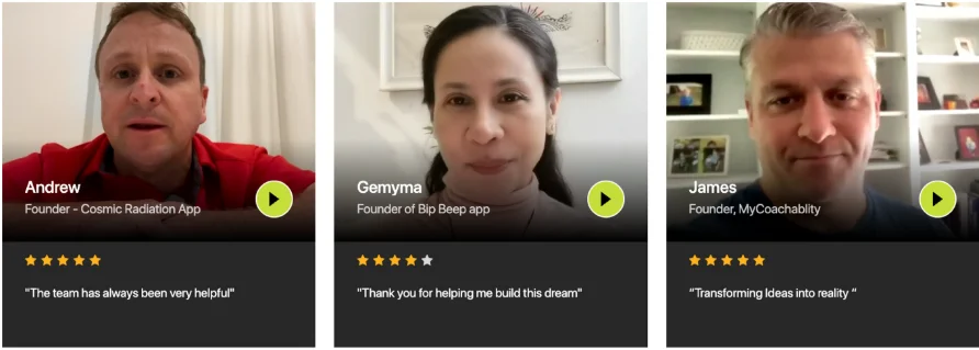
Business owners are familiar with the importance of these testimonials, yet they lock these valuable assets on a separate page.
Keep these reviews where you want the readers to take action, like landing pages about us and the homepage.
➤ Tips To Use Social Profs And Testimonials
- Ask your customers to share their reviews and use them on your landing page with visuals.
- Use testimonials, especially from your target audience.
- Try to get testimonials from high authorities.
- Include statistics and numbers.
- Use quality visual elements to make it more appealing.
- Focus on video testimonials as they are more persuasive.
5. Consider SEO For Organic Reach
You cannot leave SEO behind while creating your landing page. After all, your motive is to drive more visitors to the landing page.
Otherwise, what’s the point of the whole landing page if it’s not reaching the target audience.
Marketers know that landing pages created with SEO in mind will convert more due to high traffic — people interested in your work will follow the path.
➤ Tips And Tools To Consider SEO For Organic Reach
- Have a well-structured keyword strategy to use as a foundation. Use this keyword strategy as guidance to prepare further.
- Keep the URL short (not more than 65 characters) and define.
- Structure your content wisely by using title tag, heading tag, alt tag, internal links, videos, images, backlinks, etc.
- Try to keep the page speed <1.7seconds, and you are already ahead of 70% of the market competition.
- Make the page mobile-friendly.
6. Limit Choice & Eliminate Distractions
Most people have a hectic schedule and stressful life. It would be best if you didn’t give them another headache by complicating the procedure.
Have a look over the Chase website. This is excellent for what NOT TO DO with your landing page.
What’s wrong here? Any guesses?
The problem with Chase is overstuffed information with too many CTAs. This can easily distract the visitors resulting in a high bounce rate.
Here is a different site with a perfect balance of elements, zero noise, and limited choice — Semrush.
It has a clean interface with a single CTA.
➤Tips Limit Choice & Eliminate Distractions
- Understand the purpose of your landing page before beginning.
- Implement the Rule Of One — one goal, one CTA, and one focus.
- Remove unnecessary navigations and keep your navigation bar clean.
- Sick with a consistent business color palette.
- Eliminate too many motion graphics and autoplay videos.
7. Make An Irresistible Offer
How many newsletters have you subscribed to get a free tool, checklist, template or e-book?
Well, these were some irresistible offers that made you drop your email and confirm the subscription.
Your competitors provide the same product, service, solution, and promises, so why should they (your visitors) choose you?
Offer them something irresistible!
➤Tips And Example To Make An Irresistible Offer
- Think of your audience’s pain, perspective, goal, and ways you can benefit them.
- Analyze your competitors and offer something better.
- Lower the entry-point offer if it’s possible. Try to solve one issue at the moment of offering.
- Find ways to reverse audience risk or a guarantee.
- Express the transformation you will bring.
- Casper has a great example of an irresistible offer in the D2C market.
Best Practices in Creating a Landing Page – FAQs
Q1. What are some of the best landing page practices for better user acquisition?
The best landing page practices for better user acquisition:
- Add business details and contact information.
- Create a short, unique, and evoking headline.
- Use a strong CTA button with a contrasting color.
- Propose an undeniable offer.
Q2. What are some of the best examples of landing pages and their practices that are vital to use to resonate with our buyer’s whole journey in B2B marketing?
Here are the top 4 that we have picked with their best practices:
Shopify: Taking the first step is extremely easy.
Thinkific: They show the expected results at each step.
Impraise – Providing a free e-book to drive the visitors in the funnel.
Salesforce – Using the power of numbers.
3. What are some best landing page building tools for PPC campaigns, and why?
➤Unbounce
- It is an easy-to-use tool for the drop and drag technique.
- Has a good collection of modern templates.
- Suitable for newbies.
➤ Elementor
- Free to use.
- Much flexible in terms of designing
- Suitable for experienced designers.
➤ Instapage
- A cheaper alternative to Unbounce.
- Suitable for beginners.
- Easy to use.
Key Takeaway
- Insert high-quality images and graphics.
- Show testimonials from authoritative sources.
- Be specific with CTA and button color.
- Avoid distractions and confusion.
- Keep the interface clean and straight.
- Make sure the copy reflects the purpose.
- Keep the headline short and convey a clear message.
- Propose an irresistible offer.
Bottom Line
Building the perfect landing page isn’t about adding more elements but about making every element count. From headlines to CTAs, each step plays a role in guiding visitors toward action. By learning how to build the perfect landing page and applying these best practices consistently, you can boost conversions, build trust, and ensure your landing page delivers real results.”